
The Geo Region Fulfillment & Shipping Costs dashboard is a combination of widgets: Key Performance Indicators (KPIs), focused metric tables, graphic displays of your data, any data tables can be quickly exported to a spreadsheet for further analysis. The data displayed on the dashboard is intended to give you actionable insights into your regional shipping destinations, fulfillment locations, delivery methods, as well as customer and guest checkout habits.
Note that this dashboard reflects your metrics for orders that have been assigned shipping information.
You will see different date filters on the dashboard - the Fulfillment & Shipping Costs section (top of dashboard) will respond to the Review & Comp Date filters. The Orders Fulfilled by Marketplace section (bottom of dashboard) will respond to the Shipment Date filter. Each of these sections has a heading banner with the filters noted on it.
You will see a link to this document in the heading of the dashboard, click on Dashboard Help to access the document.
KPIs
At the top of the dashboard, a selection of KPIs appear in two rows. You control the date ranges for these KPIs with the Review Date and Comp Date filters on the dashbaord. A useful application of this section is to compare the KPIs for two time periods to gauge performance, as well as measurement for initiatives you may be testing. For example, you can watch the top row of metrics to be sure your expected performance is on track for the month, and make adjustments as needed. As you initiate operational changes and set goals to measure success, you can use this section of the dashboard to know how the results compare with your goals and with previous results.

Focused Metrics
There are sections of these mini data tables on the dashboard. The focus areas display data for order metrics by weekday and fulfillment locations, and can be filtered by shipping method. If you hover to the right of the field names, you will see an arrow that allows an ascending/descending sort. The data here can be helpful in understanding the staffing needs at a location level. Note that on weekday based metrics, you'll want to be sure to choose a date range that has the same number of each weekday - for example, choose a date range that starts on a Sunday and ends on a Saturday.

Graphic Displays
There are sections of graphic displays on the dashboard. The first graphics display maps for fulfillment & shipping destinations so you can monitor and make adjustments to your operations & marketing strategies.
On maps that will auto-zoom as you filter the attributes, you have a side by side view of your fulfillment locations (red markers) and the areas where they ship orders (green and orange markers); this feature is especially useful if you have multiple warehouse locations or for local shipping considerations. The green and orange markers identify where you have single and multiple orders to the same shipping destinations, and the size of the markers indicates the average order amounts. By clicking on a specific fulfillment location on the map to the left (or using the filters on the right side of the dashboard), you will see the corresponding deliveries on the map to the right. If you have multiple fulfillment locations in the same area, you may find opportunities to consolidate. You can also click on a specific order on the map to the right and see the fulfillment location on the map to the left. You can gain perspective on volumes by shipping method, for example, you might select a specific Mail Class and find that it is favored only in certain areas that can be serviced more efficiently with another option.
Graphics will often tell a story about your business or operations that is not obvious when looking only at metrics. Mapping your data can quickly reveal customer habits and help you refine your delivery options. You can make more informed decisions about your business when you combine what your data is telling you with the knowledge you have about influencing factors such as promotions and shipping incentives.
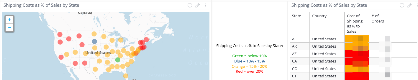
There is a mini data table on the dashboard to highlight shipping costs. The focus area displays data for shipping costs as a percentage of sales, by state; it also includes the number of orders for each state. This table supports the map to the left with a geographic view of your shipping costs. If you hover to the right of the field names, you will see an arrow that allows an ascending/descending sort. You'll also notice that the cost percentages are color-coded, to alert you to the bands where your shipping costs are inside or outside your operational boundaries. When you focus on states where your shipping expenses are high, you can look at the relevant detail in the fulfillment maps and inform your structure of shipping options. You can export the data in the tables, to work with it outside of the dashboard. Do this by clicking on the 3 dots at the top right corner of the widget, choose Download and export an image or file. The recommended file type for a spreadsheet is CSV.
Additionally, there are graphics display trends for key metrics on shipping costs and cost as a % to sales, as well as mail class distributions of these metrics. You might find that certain delivery options are not widely used, or used in concentrated areas; this information can help you determine the options to offer. You can monitor shipping costs against delivery options, and determine the cost effectiveness of the options you offer. You might find that offering incentives for certain delivery options can increase order amounts - these graphics can help you monitor changes to your offerings.

Finally, a line graphic will show your trends for shipping costs. You are able to switch the view from a date to your shipping options (or Mail Class) by right clicking on the graphic. Note that to switch between various date granularities (months, weeks, etc.) you will need to switch to the Mail Class, then back to a date option.

The final section of the dashboard reflects orders that have been fulfilled, in other words have been shipped from each marketplace order. If your operation uses Amazon, for example, you'll see the Amazon orders that have been shipped within the date range that you select in Shipment Date. This section of the dashboard will not respond to the Review Date or Comp Date filters - it will not necessarily correspond to the number of orders in the KPIs at the top of the dashbaord since those are based on the order date that you selected in the Review or Comp Date filters.
The dates in the table represent the week of the shipment - you are able to right click on any of the weeks and expand them to the day of shipment. A simple graphic to the right will show you how your marketplace order shipment volumes compare.

Was this article helpful?
That’s Great!
Thank you for your feedback
Sorry! We couldn't be helpful
Thank you for your feedback
Feedback sent
We appreciate your effort and will try to fix the article